by Roman Egger
By its very nature, tourism is closely linked to geospatial data. Nevertheless, publications dealing with geo-analytical issues are rather the exception in tourism literature. This is probably due to the fact that geographers if they publish in a tourism context, tend to publish in their geo-community rather than in tourism-related journals. This is also the reason why I have included this topic in the book under chapter 24. Andrei Kirilenko provides insights into basic terminology, typical problems and methodological approaches to make them accessible to tourism researchers. I, too, have been dealing with geodata to a greater or lesser extent for some time and would like to present an exciting method for tourism at this point. Geodata is available to us either through observation, GPS tracking (see our study in the city of Salzburg or the study of the “Freilichmuseum”, I did with my students), recently also increasingly through the use of mobile phone data. In this example, I use GPS data from mobile devices of tourists in Salzburg (3 Months in 2019), I received from NEAR. NEAR sells GPS data from 1,6 billion users in 44 countries, with 5 billion events processed per day. So this easily becomes real big data!
On the one hand, these data can be segmented according to the markets of origin in order to identify a possibly different behavior of the markets. For city destinations, however, the movement patterns of tourists are of particular interest. So what are the destination’s “beaten tracks” – questions that are particularly relevant in destinations struggling with the overtourism phenomenon.
The first graphic shows the available GPS data of tourists in the city of Salzburg. In addition, red dots can be seen.
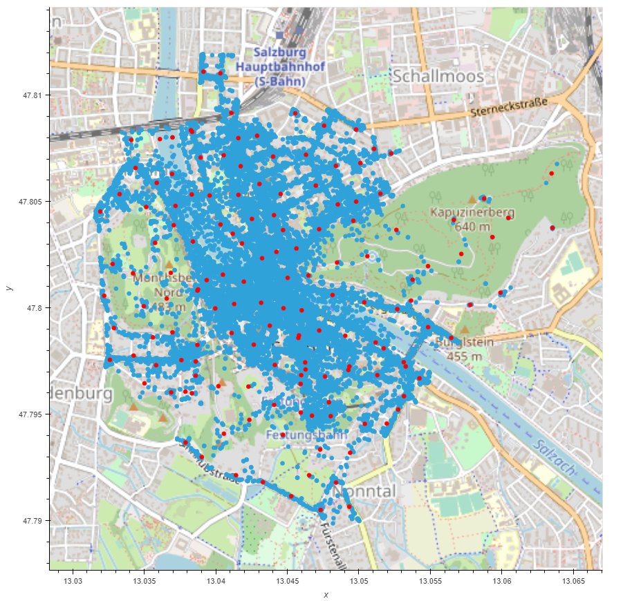
Here I used the Python Library “MovingPandas” by Anita Graser. Cluster points are created and subsequently, the frequency between the points can be visualized.
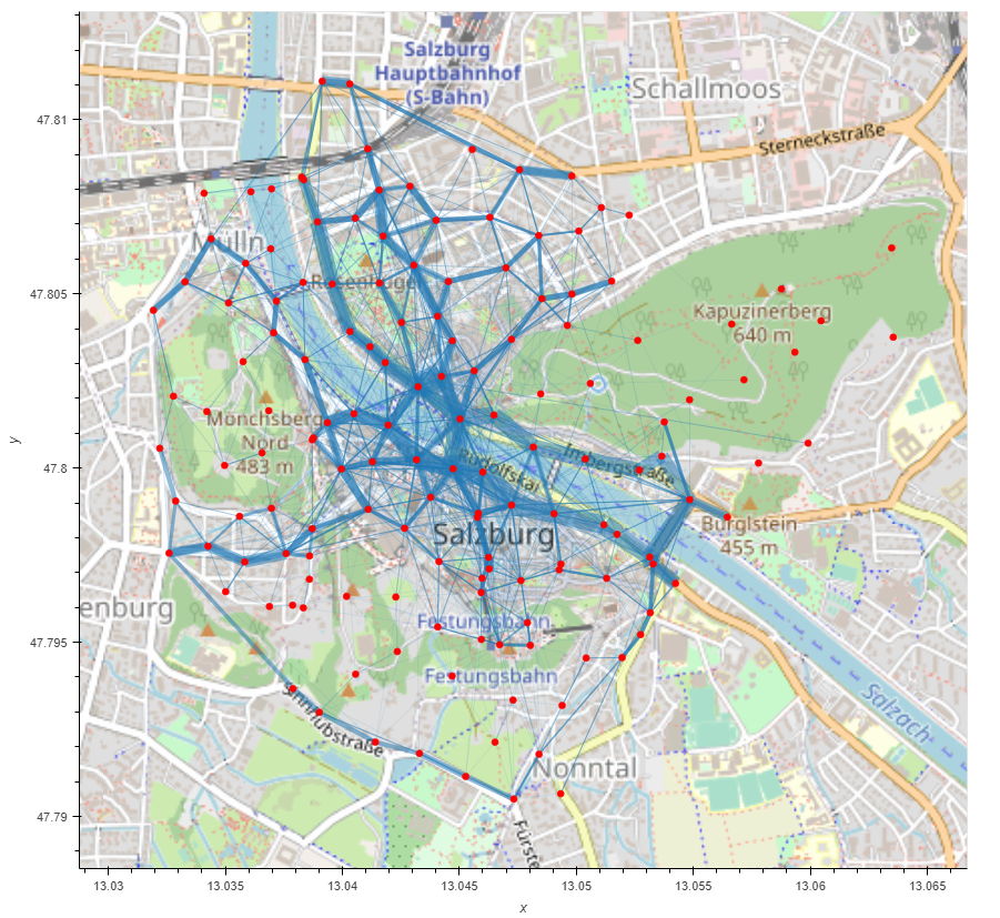
The thicker the line, the more frequented the distance between the two clusters. Thus, it can be visualized very well how tourists navigate through the city. Unfortunately, MovingPandas still lacks the possibility to adjust the edges to the streets, so that the lines go across the river or over buildings. Nevertheless, it is an exciting approach to capturing typical moving patterns of tourists.
And this is how it´s done (code adapted from Anita´s examples):

df = # load your dataset with columns “Latitude”, “Longitude”
crs = {‘init’: ‘epsg:4326’} # assign CRS
geometry = [Point(xy)for xy in zip(df[‘Longitude’], df[‘Latitude’])]
geo_df = gpd.GeoDataFrame(df, crs = crs, geometry = geometry) # build GEO-Dataframe
geo_df[‘Date’] = pd.to_datetime(geo_df[‘Date’]+ ‘ ‘ + geo_df[‘Time of Day’])
geo_df = geo_df.set_index(‘Date’) # the date needs to be your index
traj = mpd.Trajectory(geo_df, traj_id=”DeviceID”, obj_id=’DeviceID’, t=”Date”, x=”Latitude”, y=”Longitude”) # generate trajectories
traj.add_traj_id()
traj.add_direction()
traj.add_distance()
traj.add_speed()
traj._add_prev_pt()
traj
traj_collection = mpd.TrajectoryCollection(geo_df, traj_id_col = “DeviceID”, obj_id_col=”DeviceID”, t=’Date’, x=’Latitude’, y=’Longitude’) # build the trajectory collection
trips = mpd.ObservationGapSplitter(traj_collection).split(gap=timedelta(minutes=5))
pts = aggregator.get_significant_points_gdf()
clusters = aggregator.get_clusters_gdf()
( pts.hvplot(geo=True, tiles=’OSM’, frame_width=800) *
clusters.hvplot(geo=True, color=’red’) )
flows = aggregator.get_flows_gdf()
flows.hvplot(geo=True, hover_cols=[‘weight’], line_width=dim(‘weight’)*0.01, alpha=0.5, color=’#1f77b3′, tiles=’OSM’, frame_width=500) *
clusters.hvplot(geo=True, color=’red’, size=5) )